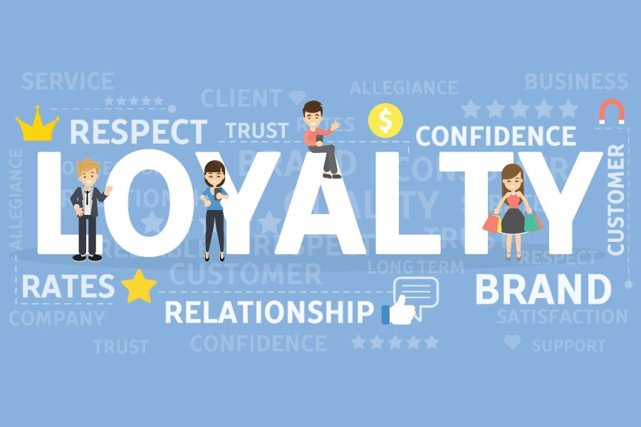

This article was created to assist you in creating or refining your loyalty program’s UX & UI design. We’ll go over a number of best practises and real-world examples from businesses that have successfully incorporated loyalty programmes into their regular operations.
It should be noted that all desktop screenshots were taken using Chrome on a Mac, while all mobile screenshots were taken using Chrome’s iPhone X resolution.
Publicize your loyalty programme.
If your loyalty programme is not sufficiently promoted and through the appropriate channels, your participation will not increase. Include links or banners directing visitors to your loyalty programme in the most crucial touchpoints after starting with your platforms. Some ideas are provided below:
The homepage of your website receives the most traffic. There should be a mention of your loyalty programme since it is a vital component of your service. There are many ways to display it on the homepage, including:
Ribbon, Footer, or Menu
Your loyalty programme link can be added to the website’s main menu, top ribbon, or footer. Then, it will be visible on all of your website’s pages. Keep in mind that, although it is the least noticeable of the three, all three can be used to make the loyalty programme accessible from any subpage.
Tell participants of loyalty programmes how many points and awards they have earned.
You should routinely update your consumers on their point balance and membership status in order to promote additional purchases and involvement in your loyalty programme. A few UX best practises are listed below for your use:
To express rewards for progress, use images.
Use images to help users comprehend the rewards that are offered. You might, for instance, display their current loyalty tier and the number of points required to advance to the next one. You can indicate how many more points they must earn to receive the subsequent incentive (for instance, 10 more points to receive your $20 off voucher). Additionally, you can display “locked” awards to let consumers know how many additional points are required to unlock them.
How can I apply rewards or loyalty points in my shopping cart or during checkout?
How users can spend their points at the checkout is a crucial component of the loyalty program’s UX and UI design (or in their baskets). Inform customers throughout the checkout process if their purchase qualifies for payment with their points balance if the points can be used as a form of payment. You may give them the option to select the number of points they want to apply to that transaction.
If the users’ points can be converted to rewards, you can either allow them to do so at the checkout or send them to another page where they can choose their prizes before returning to their basket.
List all awards (points, coupons, discounts, products, etc.) that are available in the basket and allow clients to apply them to their orders is the most user-friendly method. Customers will be able to spend their rewards extremely easily thanks to this, and your cart abandonment rate won’t change as a result (like linking out to rewards catalogue or customer cockpit would)